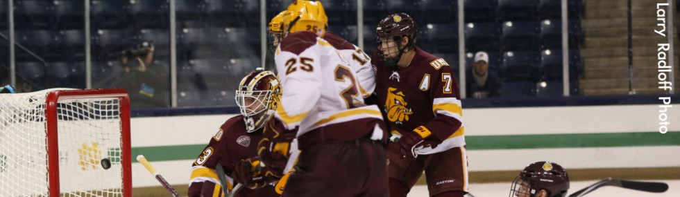

The Worst Sweaters in Recent History
This update to a popular Napkin from a decade ago that appeared on the old INCH site stemmed from a Twitter comment I made while watching Michigan and Notre Dame last Friday—namely, that the Wolverines’ sweaters that night were alarmingly garish. This rundown includes a few holdovers from 2003 and a handful of new entries. Ironically, the Michigan jersey that sparked this sartorial redux isn’t on the list.
The Holdovers
• Denver’s Goldmember thirds: We named this sweater after the third and final installment in the Austin Powers trilogy. Ten years later, it looks like something Psy would wear.
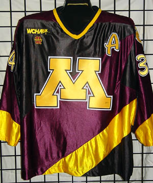
• Minnesota’s “flag team” jerseys: The Gophers wore these to mark the 75th anniversary of intercollegiate hockey at the school. Instead, they chose to commemorate the worst part of a marching band.
• Wisconsin’s roadkill Bucky: “If you hit Bucky Badger with your car and he was sprawled across your windshield, it’d look like this jersey,” is what we said back in ’03. Gets my vote for the worst sweater ever. A complete disaster on every level.
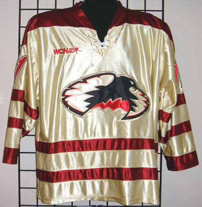
• Yale’s flying Bulldog: The crest is really what puts this sweater over the top. It looks like college hockey’s first and only 8-bit logo.
• UMass’s triangle jerseys: Here’s what baffles me in cases like this—one would think this design had to be approved by multiple people in the athletic department. How did no one put their foot down on this ode to geometry?
• Dartmouth’s motion D: Twitter follower @sportsgirlkat said the crest looks like a novelty hair trimmer. Based on the motion lines, doesn’t it appear as if the D is going in reverse? Perhaps it represents Hugh Jessiman’s career.
• Minnesota State’s golds: If the goal was to make the team look like banana Popsicles, then mission accomplished.
• Northeastern’s mid-1990s jerseys: The jerseys in and of themselves aren’t bad. It’s that logo on the crest, which looks like it was lifted from a regional transit authority.
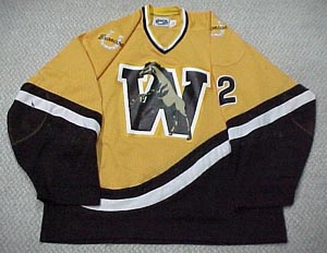
• Western Michigan’s late-1990s: The colors, the wavy stripes, the logo. Was this design lifted from someone’s customized 1970s panel van?
The Newcomers
• Ferris State’s early 2000s diagonals: Hockey sweaters with diagonal stripes are as much a part of the ’90s as oversized flannel shirts and crappy Gen-X movies. The entire diagonal-striped genre was forgettable, but Ferris’s jerseys with the additional horizontal stripe running just below the shoulder looked ridiculous.
• Quinnipiac’s early-2000s diagonals: Wow. Just, wow.
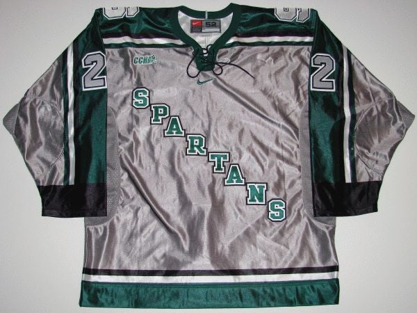
• Michigan State’s and New Hampshire’s silver thirds: These jerseys are fine—if you’re making giant baked potatoes.
• Any non-skating Friar Providence jersey: The skating Friar is a classic. Try to find someone who doesn’t like it. You can’t. So, of course, the school rebranded its athletics identity and went with some sort of Clark Kent-Red Riding Hood mash-up. Thankfully, it wasn’t long before the skating Friar returned.
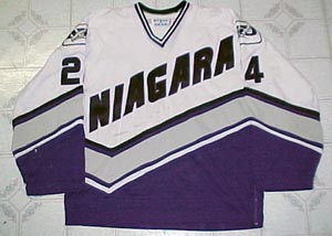
• Niagara’s late-1990s diagonals: Yeah, the diagonal look is terrible, but what really caught my eye (threatened it, actually) was the goofy lettering. I can’t tell if the crest was drawn on with a Sharpie or cut out and stitched by local first-graders.
• Ohio State’s striped sweaters: Apologies for the small image. It’s hard to find a good photo of these scarlet-and-grey striped doozies. Guess the guys who had to wear them tried to destroy all the evidence.

You apparently missed the beauties UNO introduced early this season.
Front: http://www.omavs.com/images/2012/10/20/rp_primary_Northern_7_web.jpg
Back: http://www.omavs.com/images/2012/10/20/rp_primary_Goal_vs_Northern.jpg
Pingback: Maine Preview; Triangle Time | Fear The Triangle - UMass Hockey Blog
I looked all over the internet and couldn’t find an image but the 1994-95 Providence College pinstripe uniforms (even the socks!). Those need to find their way onto your list.
http://smokey.angelcities.com/PROVIDENCE.htm
Thanks! Every bit as bad as I remembered.
Amazing information material. Just what I was looking for!
Best regards,
Check out our new release at lepsoft..com